


We all wish for a really nice web, attractive and inviting enough to attract visitors to make their bookings on our website. Many factors influencde this: design, development or applicable marketing strategy among others. The best way is to focus only on those design factors that include photographs in varied colour, fonts that catch the eye, and harmony among the elements that make the final view the best.
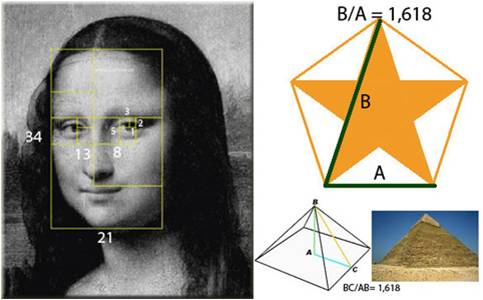
To achieve this harmony, what better than taking a tip from Nature, where for more than 2000 years the Golden Ratio, has been effective; this means, basically, a number that represents the ratio between two segments – the minor segment is to the major what the major is to the total, having a value of 1.618.
Leonardo Da Vinci , for instance, used the Goldren Ratio when he painted the Mona Lisa. The pyramids in Egypt were also built according to the Golden Ratio; even the Eiffel Tower maintains it.
Can we apply the Golden Ratio in our webs?
Eso mismo nos preguntamos hace ya algún tiempo y la respuesta es claramente sí.
La teoría dice que, manteniendo dicha proporción para los elementos de la web, podemos lograr una mayor armonía en el conjunto total y hacerla así más atractiva para nuestros clientes.
Por tanto, buscando información en la red, encontramos un post muy interesante que nos hizo probar sobre diferentes diseños nuestros.
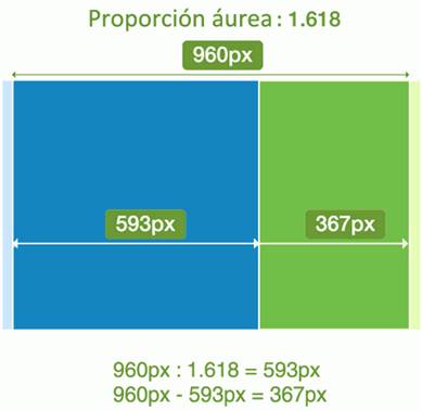
Partiendo de la base de que la resolución más extendida actualmente es 1024x768px, aplicamos dicha proporción para 960px, que es el estándar para que una web se vea bien en dicha resolución sin problemas. Por tanto, haciendo números, nos queda, a primera vista sin necesidad de scroll, un rectángulo de 960px de ancho por 593px de alto.
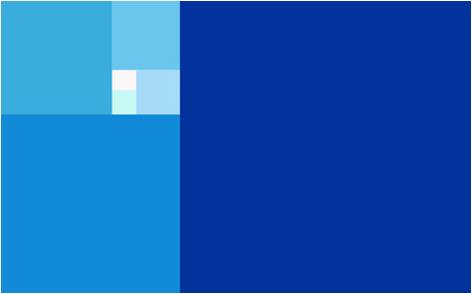
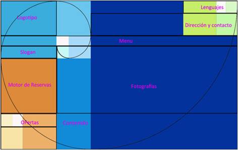
Además sabemos, por otros estudios sobre el comportamiento de los usuarios, que las webs se leen desde arriba a la izquierda, en diagonal, hacia abajo a la derecha, perdiendo relevancia según se va bajando, por tanto los elementos más importantes tienen que ir siguiendo esta tendencia. Aplicando la proporción áurea dividimos la web en bloques:
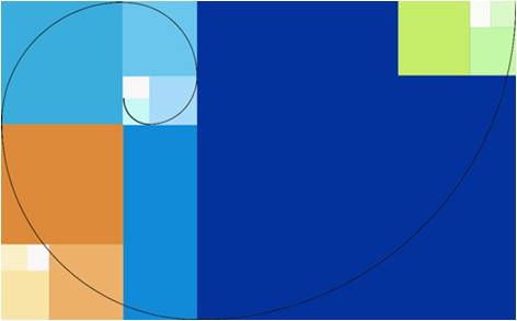
Esto nos genera una espiral logarítmica (parecida a la Sucesión de Fibonacci), que aparece frecuentemente en la naturaleza, como por ejemplo la concha de un nautilus.
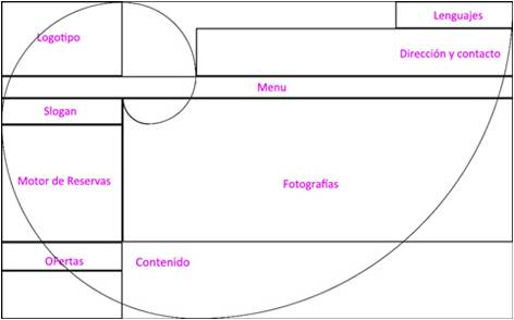
Añadiendo más elementos y manteniendo la misma proporción obtenemos lo siguiente:
Una vez determinados los espacios procedemos a incluir los elementos típicos de una web de hotel; logotipo, menú de navegación, motor de reservas, fotografías, etc, usando como guías los bloques proporcionales áureos.
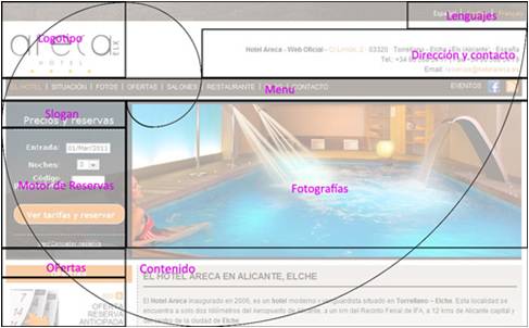
Limpiándolo un poco para que se vea más claro:
Se ve como todos los elementos importantes, logotipo, primeros elementos del menú de navegación, el motor de reservas, las fotografías, el comienzo del contenido y la dirección, quedan dentro de la espiral.
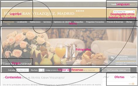
Así por ejemplo aplicándolo más o menos sobre algunas de nuestras webs queda algo así:
Y otro ejemplo parecido pero cambiando la disposición del motor para medir su eficacia:
Después de bastante tiempo (6-8 meses) de funcionamiento con estos diseños pudimos valorar que su conversión mejoró sustancialmente. Del total de visitas que llegan a estas webs más de un 35% consulta la disponibilidad y precios a través del motor de reservas del hotel.
Evidentemente mantener la proporción áurea no es lo único que hace que estas webs tengan un alto índice de conversión pero nuestra experiencia enseñándolas a muchos hoteleros y amigos son de las webs que más gustan y más llaman la atención… por algo será.We have always asked ourselves the same question and the answer clearly is Yes.
The theory is that by maintaining this ratio in the elements of the web, we achieve greater harmony in the whole, making it more attractive to customers.
So, searching for information online, we found a very interesting post that we decided to follow, employing our own different designs.
Assuming that the resoution 1024X768px is now more widespread, we apply this ration to 960px, which is the standard for a site that looks good without causing problems. So, making numbers we are left, without needing to scroll, with a rectangle of 960px wide by 593px high.
In addition, we know from other studies made on user behaviour, that webs are read from the top left, diagonally down to the right, sing relevance the further down one moves. Therefore the most important elements must adhere to this tendency. By applying the Goldren Ratio we divide the web into blocks:
This generates a logarithmic spiral (similar to the Fibonacci Sequence) which appears in Nature, such as a nautilus shell.
By adding more elements, but keeping to the same ratio we reach the following conclusions:
Having identified the areas, we move on to include typical elements of a hotel website – logo, menu navigation, booking method, photography etc., using as a guide the proportional golden blocks.
To make all this a bit clearer:
It is seen that all the important elements – logotypes, the first elements of the menu of navigation, booking method, pictures etc., commencement of contents and direction – are contained within the spiral.
Applying this more or less to some of our webs, we reach our goal.
Another exercise would be to change the layout of the booking method to measure its effectiveness:
After a good length of time (6 – 8 months) we were able to prove that the conversion is much improved. The total number of visitors to the sites wishing to check availability and prices via the booking.method was 35% up.
Obviously, keeping to the golden ratio is not the only explanation as to why these sites enjoy a high conversion rate, but our experience teaches many hoteliers and friends that these are the webs they like, and which draw the most attention – there must be a reason.
Interesting article. However I do find that this makes for a lot of elements on a home page. When you’re trying to tell a customer come and book here you want to make it even more simple. I wrote an article about the do’s and don’ts for a hotel website after some 12 years of experience which rather pushes simplicity.
http://www.mirarmedia.com/website-design/dos-and-donts-for-a-hotel-website/
nice article. should change the website now…but from my experience i preferred the design more like web 2.0 it simple and clean and easy to navigate